State of UI in Unity - UI Toolkit
UI Toolkit. It’s free. It’s built into the Unity game engine. It promises way more functionality than UGUI. Sounds perfect, right?
Well. Maybe. Turns out it just isn’t that simple.
So let’s talk about UI Toolkit.
A Bit of History
There is a huge elephant in the room when it comes to UI Toolkit. That being the development timeline.
UI Toolkit, or rather UI elements, was announced sometime in 2017 (I believe) with a roadmap released early in 2018 and the first release with some functionality came in Unity 2019.1. This was all leading to the goal of having parity with UGUI with the release of Unity 2020.3.
While UI Toolkit has come a long way - it’s still not able to fully replace UGUI. The latest official release from Unity says UI Toolkit is in maintenance mode through the Unity 2022 cycle and no new features will be added until the release of Unity 2023.
Based on the recent Unity release pattern, this means we likely won’t be seeing a feature-complete UI Toolkit until sometime in the calendar year 2024. That’s 6-7 years from announcement to being feature complete. 7 years ago I was still pretty fast on a mountain bike…
The Pro’s
UI Toolkit offers far better control of UI layout than UGUI. Many of the layout features that I find so attractive about Nova UI are either built into UI Toolkit or are on the roadmap. On top of that, UI Toolkit can be used to create custom editor windows, which neither UGUI nor Nova UI can or will ever do.
Plus! And this is no small thing, UI Toolkit allows styles or themes to be defined and reused. It’s no secret if you’ve watched any of my recent streams, I find color choice and visual design really really hard. With UGUI if you want to tweak the color of a button background, you either make prefabs, which can work sometimes, or you have to change each and every button manually. I hated this workflow so much that I built a janky - but effective - asset to let me define UGUI styles. While Nova is working on themes, they aren’t ready or available for developers just yet.
UI Toolkit also promises far better performance than UGUI - much of it is done behind the scenes with little effort from the developer. With UGUI if you change an element of a canvas the entire canvas has to be redrawn - which isn’t an issue with simple UI but can become a significant issue with more complex designs when you are trying to eke out every little bit of performance.
Despite big significant differences in how to create the UI, to Unity’s credit, much of the programming with UI Toolkit should feel familiar to folks comfortable working with C# and UGUI. While there will certainly be some nuance and naming differences, programming the interactivity of UI Toolkit should not be a major hurdle.
And of course the last big win for UI Toolkit? It’s free! For a lot of folks that right there is all the reason to ignore Nova UI and give Unity’s newest solution a serious go.
Stolen from a Unity Video On UI Toolkit
The Con’s
The biggest question about UI Toolkit is will it ever be done? Will it be feature complete? Will it truly have parity with UGUI? How much will change in the process? Will those changes break your project?
There are two big and commonly used UI features that UI Toolkit doesn’t have (yet). First is world space UI. If you don’t need it. Not a big deal. The second incomplete feature is UI animation. Some is supported but not all. Is this a problem? Maybe? Depends on your project.
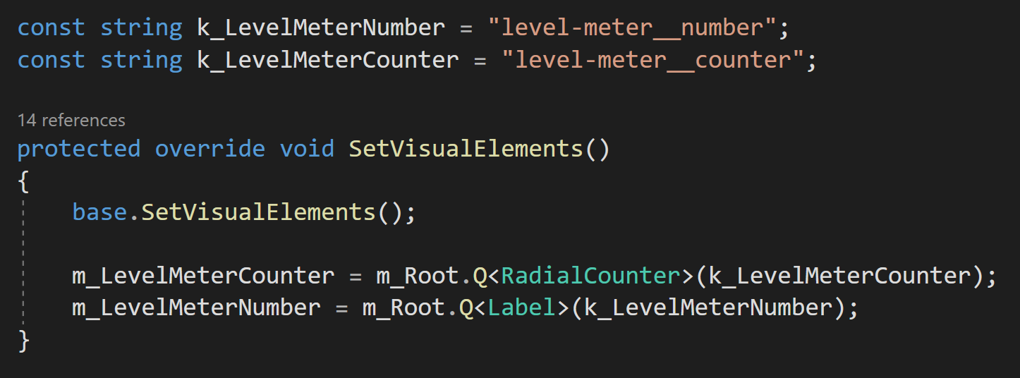
Data binding with UI Toolkit, is less than awesome. Finding objects by name? Using strings? This doesn’t feel sustainable or scalable or at the very least it’s just not a pleasant way to work. Even the devs have commented about it and are planning to revamp it with a more generic solution. What exactly that means? We’ll have to see.
With any choice of system, you need to look carefully at what it can do, and what it can’t do, and compare that to what you need to do.
The Toss Up’s
The workflow and design of UI Toolkit largely reflect web design and workflow. Is that a pro? Is that a con? That depends on your experience and maybe your willingness to learn a new approach. For me and I suspect many others this is the deciding factor. UI Toolkit feels TOTALLY different than the UGUI or Nova workflow. The pattern of gameObjects, components, and prefabs is replaced with USS, UXML, and UI documents.
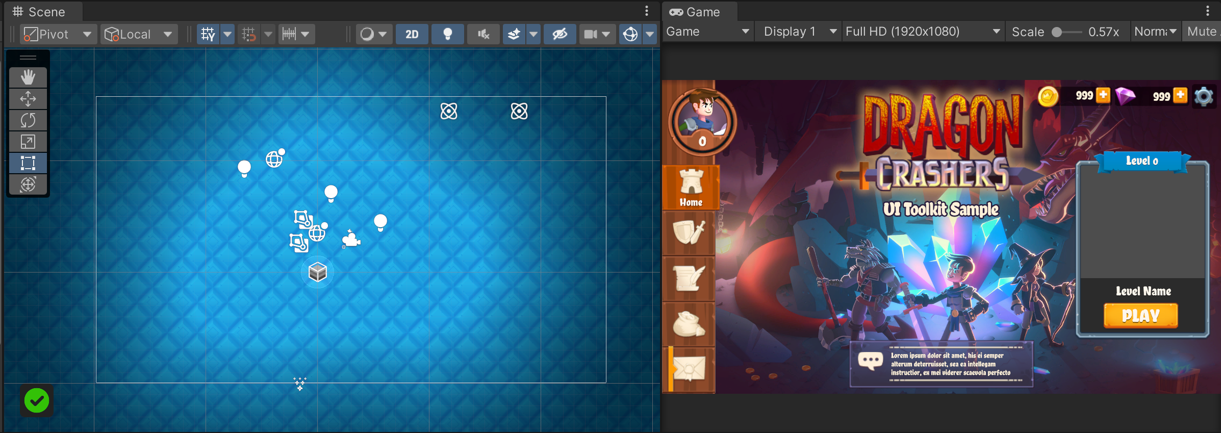
Also, the UI is also no longer really part of the scene - in the sense that you can’t see it in the scene view and it’s really in its own container. The UI elements are NOT scene objects. Again, it’s different which isn’t good or bad but it is really different.
For some, these are the exact reasons to go with UI Toolkit. For others, they’re the perfect reasons to stay with UGUI or Nova UI.
The sceneview (left) vs the GameView (right)
An Experiment
The results. Can you which result came from which UI tool?
I felt like if I was going to make a second video talking about UI options in Unity I really needed to have SOME comparison of the tools. So I set out to make the “same” ui with UGUI, UI Toolkit, and Nova UI. I wanted to create a slider that changed the alpha of an image and buttons that would collapse text. Nothing too fancy, but functions or similar to functions used in a lot of projects.
I spend about a bit longer with UGUI (18:02) than with Nova UI (17:39) and as expected, due to my lack of knowledge and experience, far longer with UI Toolkit (56:16). Those times are based on recording the process with each tool. You can see the final results in the video to the right.
In all cases, default or included assets were used. No formatting of colors, textures, or fonts was intentionally done.
I KNOW that it is possible to make this UI with all three components. The point was not to say one tool is better than another. The point was just to experience each tool and the process of using each tool. That said, for me, with my experience, my brain, and my understanding it was clear that one tool, in particular, is easily the best choice in terms of the workflow and the quality of the final result.
Let me explain more…
My Thoughts on UI Toolkit
I have zero experience with modern web development or design. I’d like to think I can learn and adapt to a new system, but I can’t explain just how foreign UI Toolkit felt to me. Sure I could drag and drop things into the UI Builder and mess around with values in the inspector, but after spending a few hours (more than just the testing above) with it I had way more questions than answers. I was playing and experimenting with Unity’s Dragon Crashers project - I had examples in front of me but I still very much struggled to see how it all worked and connected.
For example, there is a nice-looking slider in the library. It works. There are lots of great options and adjustments in the inspector. But for the life of me, I could not figure out how to scale it on the vertical axis. The horizontal axis, no problem, but make it thicker? Nope.
Video of a UI Toolkit slider at 30 fps…
I did some googling and found the same question online with no posted answer. Now clearly there is an answer. There is a way to do it. But it’s a way that I couldn’t figure out.
And then there’s the UI builder window. There’s no way to sugarcoat it, the performance of UI builder was horrible. I don’t know how else to say it. With just a few elements it’s a non-issue. But load up the main menu of Dragon Crashers and slide a few values around and the editor becomes nearly unusable. You can see the lag in the video to the right. I saw similar results in my simple “experiment” use case too.
Just to make sure I wasn’t crazy or being overly critical I opened up the profiler to do some testing. Sure enough, there’s a HUGE lag spike while dragging a value in the UI Builder inspector. This isn’t a deal breaker, but it sure makes the tool harder to use.
UI Builder lag
Strings? Really? Why?
Then I ran into my active disdain for strings. I will freely admit that when I saw that strings were being used to get references to UI elements I was really put off.
Why? Why do it that way? Why lose strongly typed references? Maybe this is how web development is done and folks are used to it. But this feels like a step backward.
The dev team agrees or at least sees it as an area to improve, so they are looking into “more generic” solutions, but right now those solutions don’t exist and who knows when or if they will materialize.
So Should You Use It?
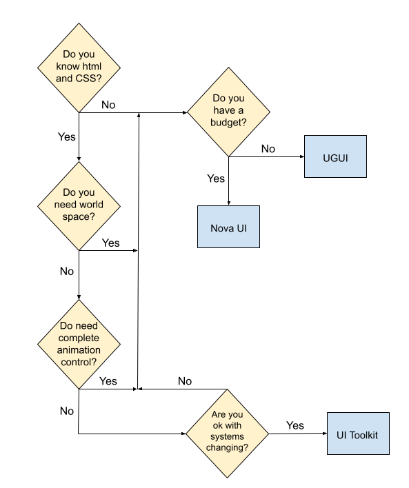
In my mind, trying to decide if UI Toolkit is the right solution comes down to a handful of questions (and a lovely flow chart).
Do you know and like web design workflows?
Do you need world space UI?
Do you need complete control of UI animations?
Are you okay with the UI system changing?
Final Thoughts
Options are good to have. I see UGUI, UI Toolkit, and Nova UI each as viable UI solutions depending on the needs of the project and the skill set of the developers. Each has shortcomings. None of them are perfect.
UI Toolkit is in this weird alpha/beta mode where it’s been released, but not feature-complete and has potential breaking changes coming in the future. Which means much of the tutorial information out there is outdated. It also doesn’t give content creators a good incentive to make more than just introductory content. This makes it harder for the average user to get up to speed. Unity keeps doing this and feels so counterproductive!
But here’s the best part of the situation. All three of these solutions can be tried for free. Nova has a free version while UGUI and UI Toolkit are shipping with recent versions of Unity. So my advice? Try them. Play with them. Do an experiment like I did. Find the right tool for you and your project. I have my UI solution. I love it. But that doesn’t mean it’s the right solution for everyone.


