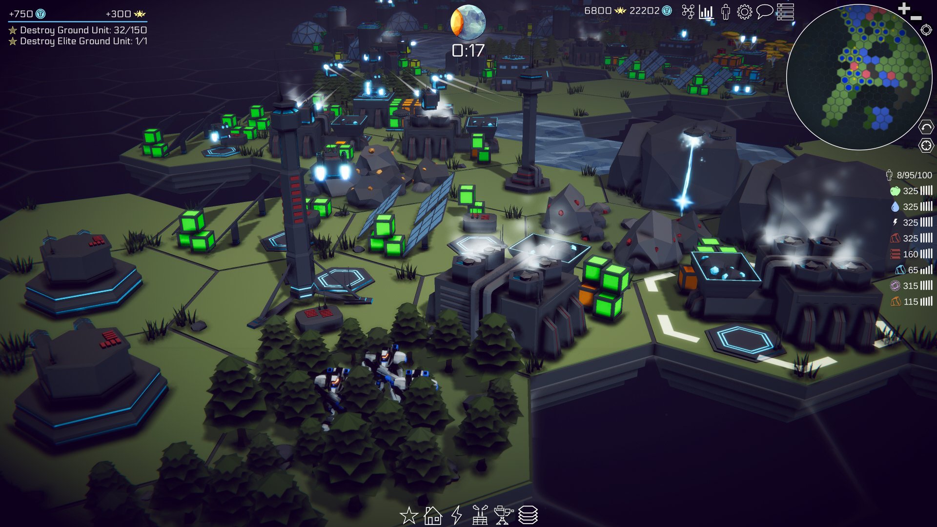
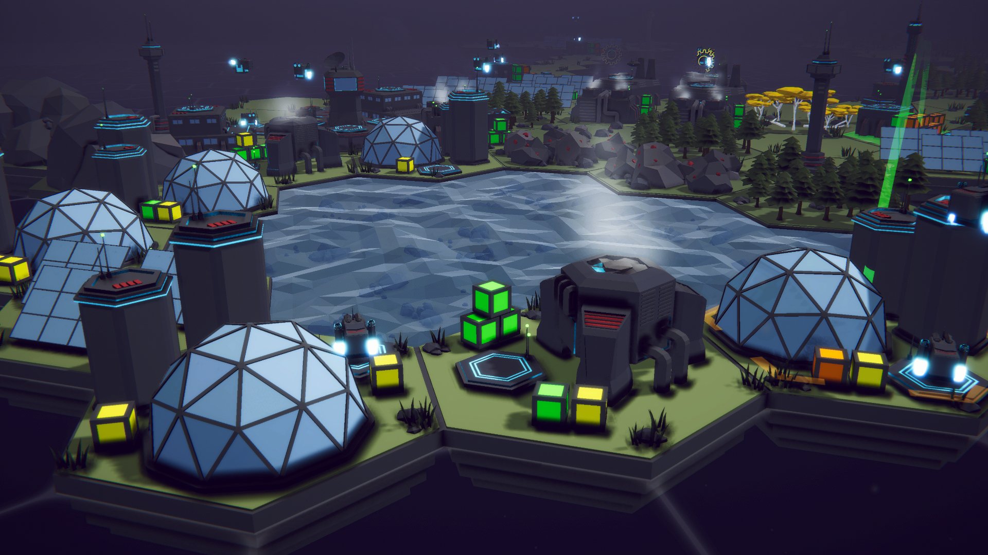
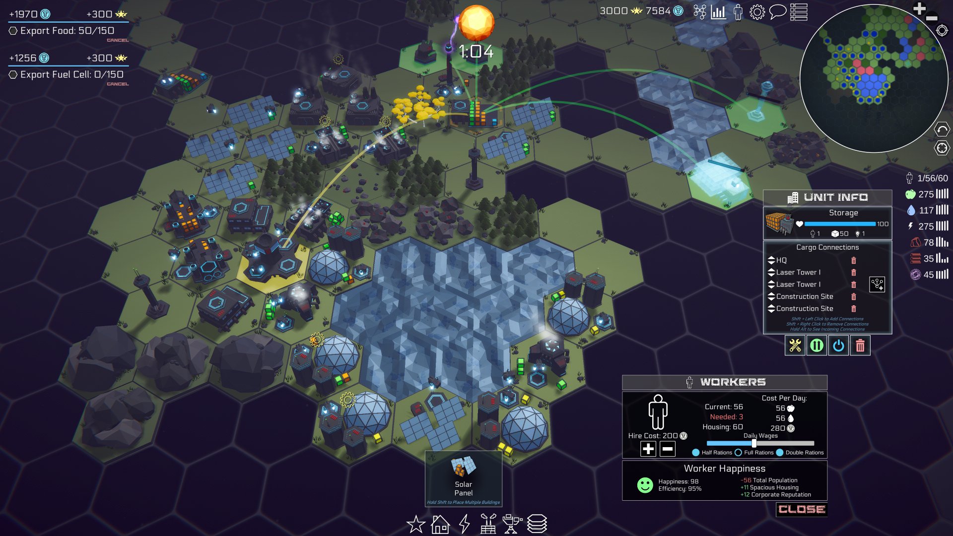
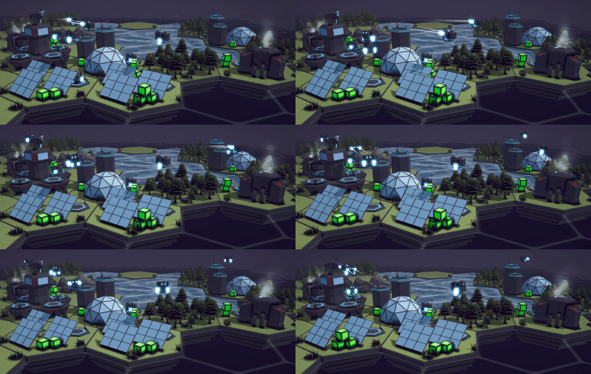
Ready for Steam Next Fest? - Polishing a Steam Page

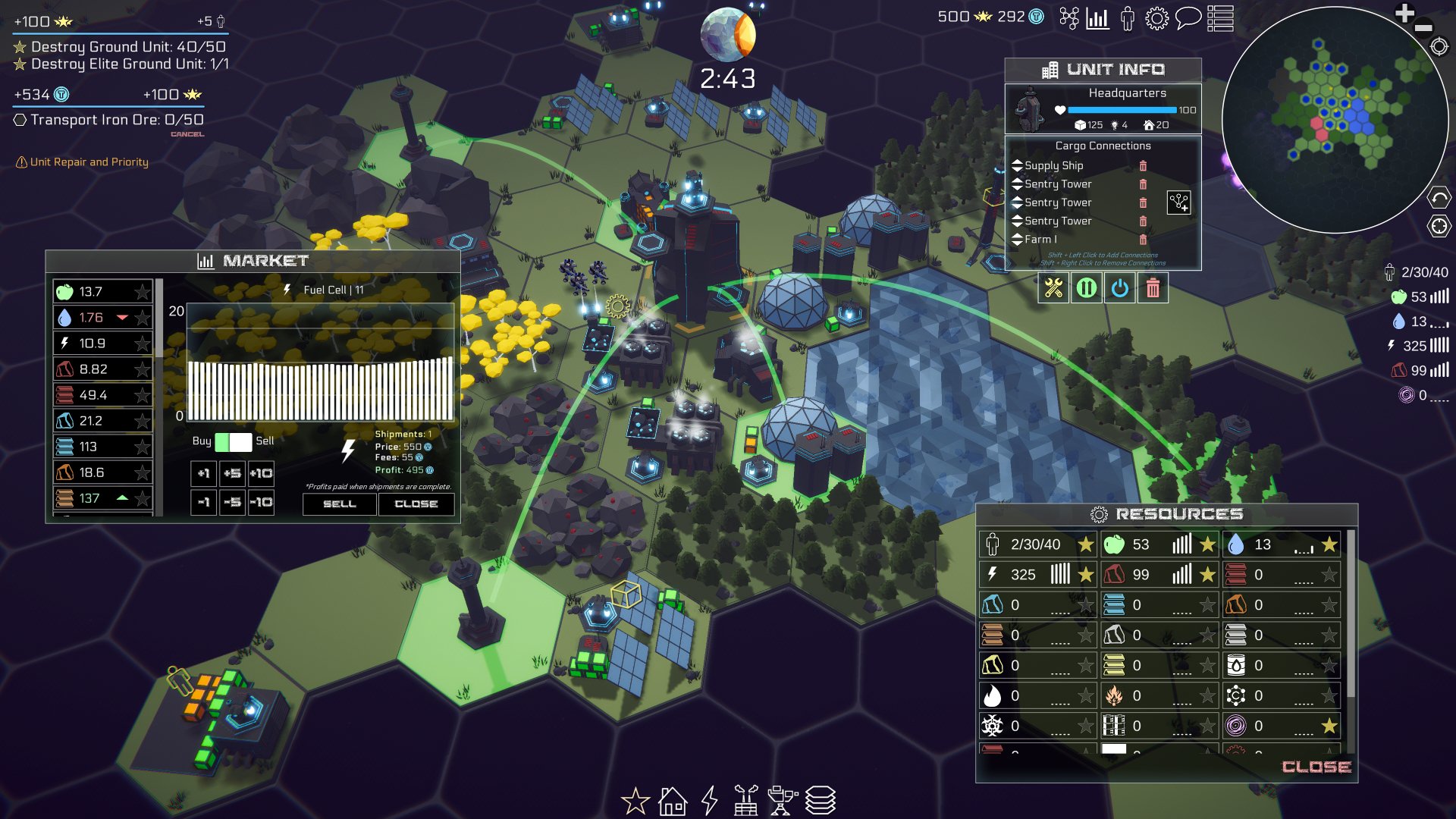
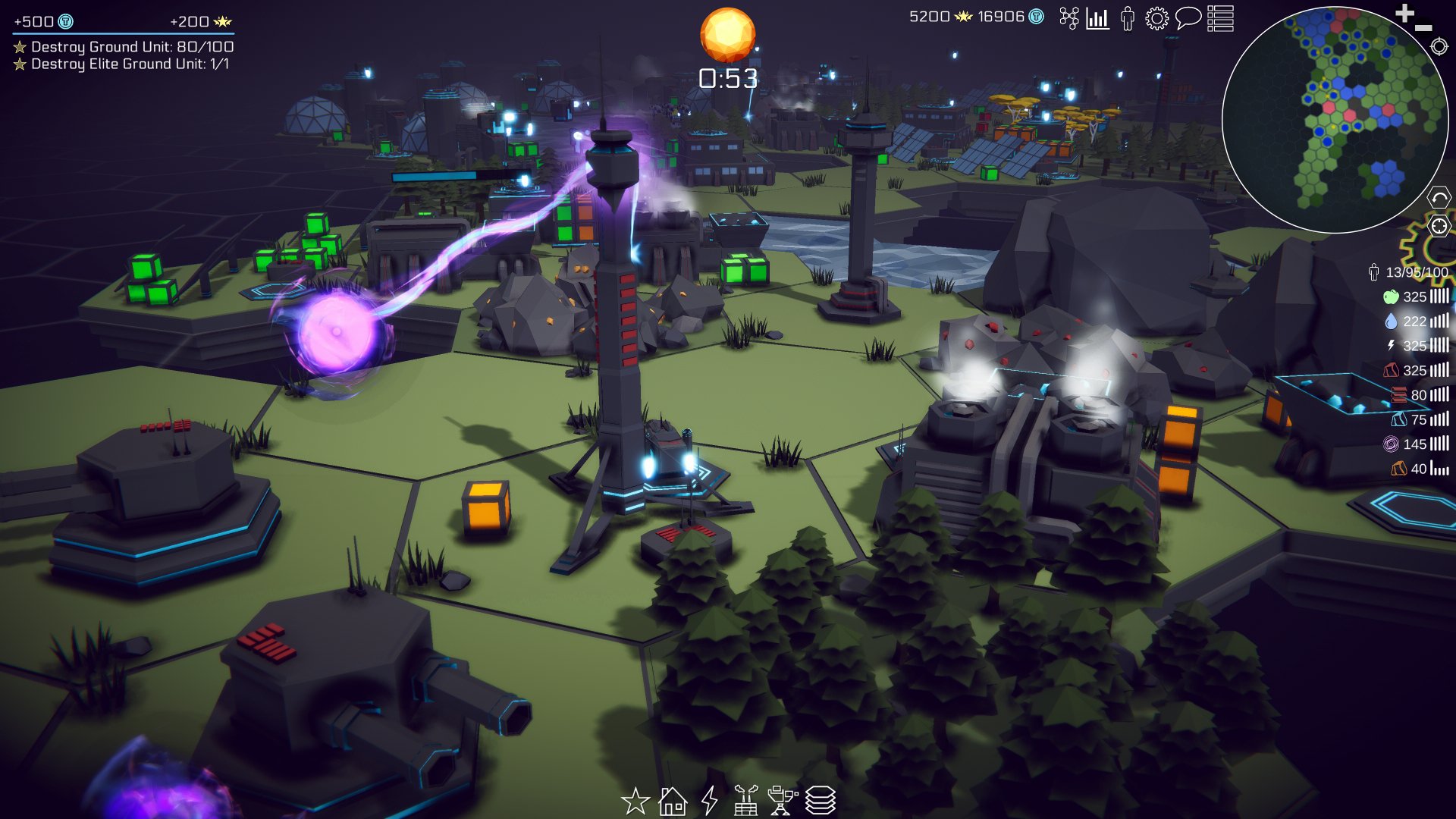
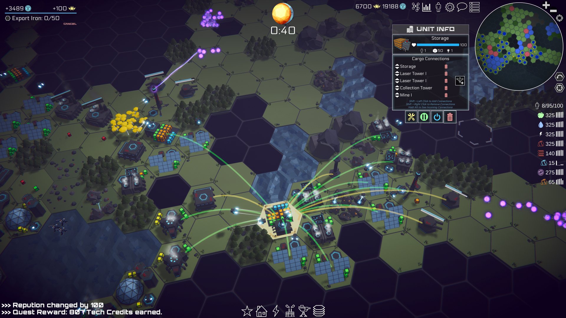
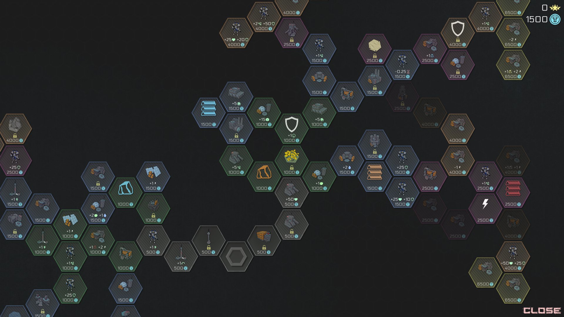
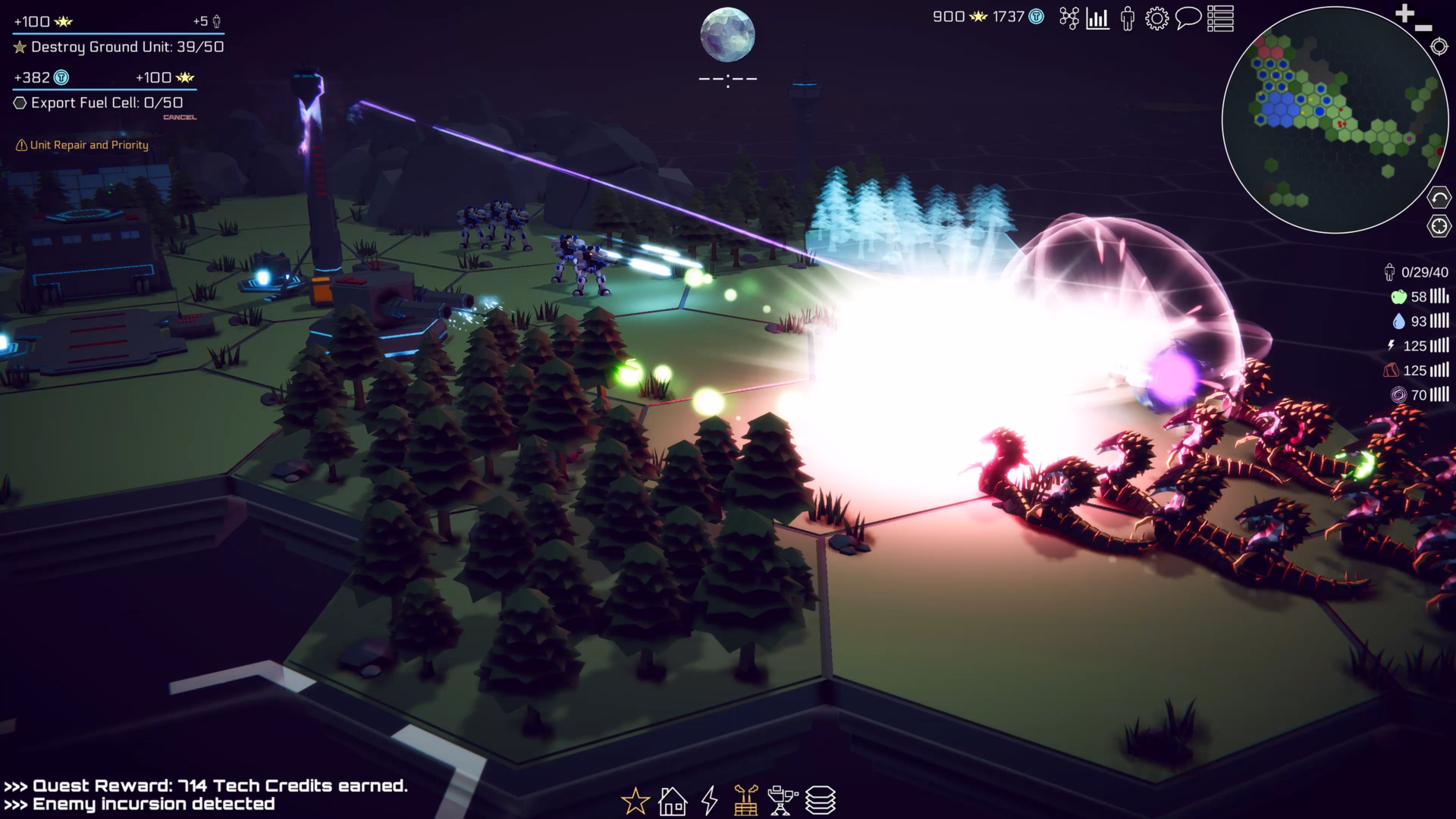
The days are counting down to Steam Next Fest - June 10th. So April was slated be all about getting the Steam page up to snuff. Or at least the best I could manage with my current skills.

The page needed new screenshots, updated GIFs, a trailer (finally), and a capsule image that didn’t look like I made it one-handed while brushing my teeth.

It's a short list but not an easy list.

Screenshots

Gathering screenshots was fun! It meant I got to play the game - a lot. The biggest challenge was not getting distracted by fixed bugs!

Unity even has built-in screenshot functionality that’ll let you upscale the image to any multiple of the game view resolution. Need a 4k image but don’t have a 4k monitor? No problem. Want an 8k image for super high detail that can be cropped down? Easy.

I added an Odin button, a slider for scaling, and a keyboard hotkey to make the tool as user-friendly as I could. As a bonus feature, I take 2 images at a time. The first is through the main camera and the second is still through the main camera, but with my UI (camera) turned off.  Having the two images to choose from is super handy! Sometimes an image looks good with the UI, other times not so much. The code is a bit of a mess, otherwise I’d share it.

Trailer

This is where things got a lot trickier. Trailers are short, but man are they a lot of work! I had visions of a slick tightly edited video that was 40-50 seconds. It would need to be designed to grab attention and drive interest. Not an easy thing to do.

This is what I’d attempted before and I was expecting to do it again.

Then a local developer shared an article with me: “The Simplest Trailer to Make for Your Steam Page.” The article doubled down on some of what I already knew and pushed hard on the idea of making a “gameplay” trailer - especially for those of us doing this as a hobby and in our spare time. A bang for the buck kind of thing, but it also gives potential customers what they want most - an idea of what the game feels like to play.

This was a huge relief and a massive boost in terms of productivity. It still took 15+ hours to gather the footage, cut it down, and edit it, but it wasn’t hard. It's not perfect, but it's something AND has made a measurable impact on Steam page traffic and wishlists. The video isn’t great for “social media.” It's not attention-grabbing, but embedded into a Steam page I think it works.

Is there still room for a cinematic or hype trailer? Probably. Will I make one? Maybe. Do I need one? Not sure.

Capsule Image

If you’ve heard anything from Chris Zukowski you’ve hopefully heard the importance of the capsule image. For most of us, the capsule image is our ENTIRE marketing strategy. We can make attempts at posting on Twitter, Reddit or YouTube, but converting those viewers into wishlists or sales is really, really hard. But! Once a user is already on Steam and sees an engaging capsule image it's a whole lot easier to get them to click that wishlist button. So with limited marketing skill, time and budget investing in a great capsule image makes a lot of sense.

I’ve had a placeholder capsule image on my page for months now. It’s nothing special. I always had the intention of replacing it with something more professional and eye-catching. I knew I was going to need to hire someone.

So, I went looking for an artist on Reddit, by posting in the GameDev Classified subreddit. It was less than productive… I don’t recommend it.

So I went to Fiverr and UpWork and found low prices but also fairly low-quality work. It was better than I could do, but not eye-catching and the images really didn’t make me want to click or learn more about the games.

I kept searching and looking. Where are all the artists?

I got on to Art Station and started to find a couple that looked better than what I’d found on other sites. There was one artist that I kept coming back to. Her work wasn’t necessarily the style I had envisioned, but it was good. The images told a story, they showed what the game was about, and they made me curious about what I’d see if I clicked. A few emails later and she’s started working on putting together sketches!

You can see Jess Thomas’s work for yourself -Website and Instagram. Her rates aren’t cheap. They really aren’t, but her work is really nice. I don’t know if it’ll pay off in the end, but if this is going to be how most players first learn about my game? Then I’ve got to try. (I’ll post her work once I get it.)

GIFs

An often ignored detail of a Steam page is adding GIFs. Most users will skip through a trailer potentially missing several scenes in the process. With GIFs embedded in the page you have the ability to pretty much ensure that a user will see a particular set of images! That’s kind of amazing.

Chris Zukowski recommends having trailers to show off the entire game loop. Which, like most of his advice, makes a ton of sense.

For making GIFs, my tools of choice are OBS to capture the footage and Davinci Resolve to edit and render the final GIFs. I made my GIFs 606 by 256. 606 pixels seems to be the best fit to the width of the Steam page! And 256? That seems to be the minimum rendering height for Davinci Resolve, which seems perfectly fine.

Come Take A Look

If you haven’t already, come take a look at the page. I’d love to hear your thoughts. What’s good? What could be better? Did I miss something?

Splitting Vertices - Hard Edges for Low Poly Procedural Generation

This isn’t a procedural generation post. There are plenty of videos and posts explaining how to generate procedural meshes. There’s no need for me to recreate that.

Rather this post should help in turning your procedurally generated mesh into a mesh with hard edges that is used in most “low poly” models. The post assumes is that you ALREADY have a procedural mesh who’s edges are smooth and you’d like a more traditional low poly or hard edge appearance. It also assumes that you understand the basics of vertices and triangles that make up a mesh.

What is a split edge?

Have you ever noticed that “low poly” assets often have a large number of vertices when imported to Unity? I had. I knew it was a thing, but never knew why.

The reason comes from the normals of the vertices, which are generally calculated from the normals of the triangles (which make up the faces) that use a given vertex. If multiple triangles use a vertext then the normal of the vertex is the average of the all the triangle normals. Which can cause a smoothing of the edges.

Vertex normals (blue lines) with smooth shading

Vertex Normals (Purple Lines) with Hard Edges

To fix this we need each vertex to only be used by a single triangle. This way the vertex normal is the same as the individual triangle normal. But how does that work? Surely the vertex on the corner of a cube must be used by three sides!

The trick is to duplicate the vertex for each triangle. In a normal cube, this means we go from 8 vertices to 24. Each side of the cube has 2 triangles, so 12 total triangles and each triangle needs 3 vertices. Which is why when we import models from Blender into Unity that are flat shaded the number of vertices increases substantially - it may not always be 3 times as it depends on the geometry but it’s often close to tripling. When we import into Unity, it can do the vertex splitting automatically, but when generating models procedurally we need to do it ourselves.

The images above are from Blender where you can toggle what normals are shown. So it’s a bit fudged, but it demostrates the idea. Both cubes are also shown with hard edges since this is the default in Blender. Smooth rendering in Blender looks a bit different than in Unity so I just left them both with hard edges :)

How do we do it?

I struggled with this part as I wanted to split the vertices as I created the mesh, but I quickly realized the easiest way would be to split the vertices after the mesh is created - which also makes it a pretty universal method. With that approach its relativiely simple.

Big picture: To split the vertices we need to duplicate the vertices and then reassign triangles indices so the triangles refer to the new and correct vertices.

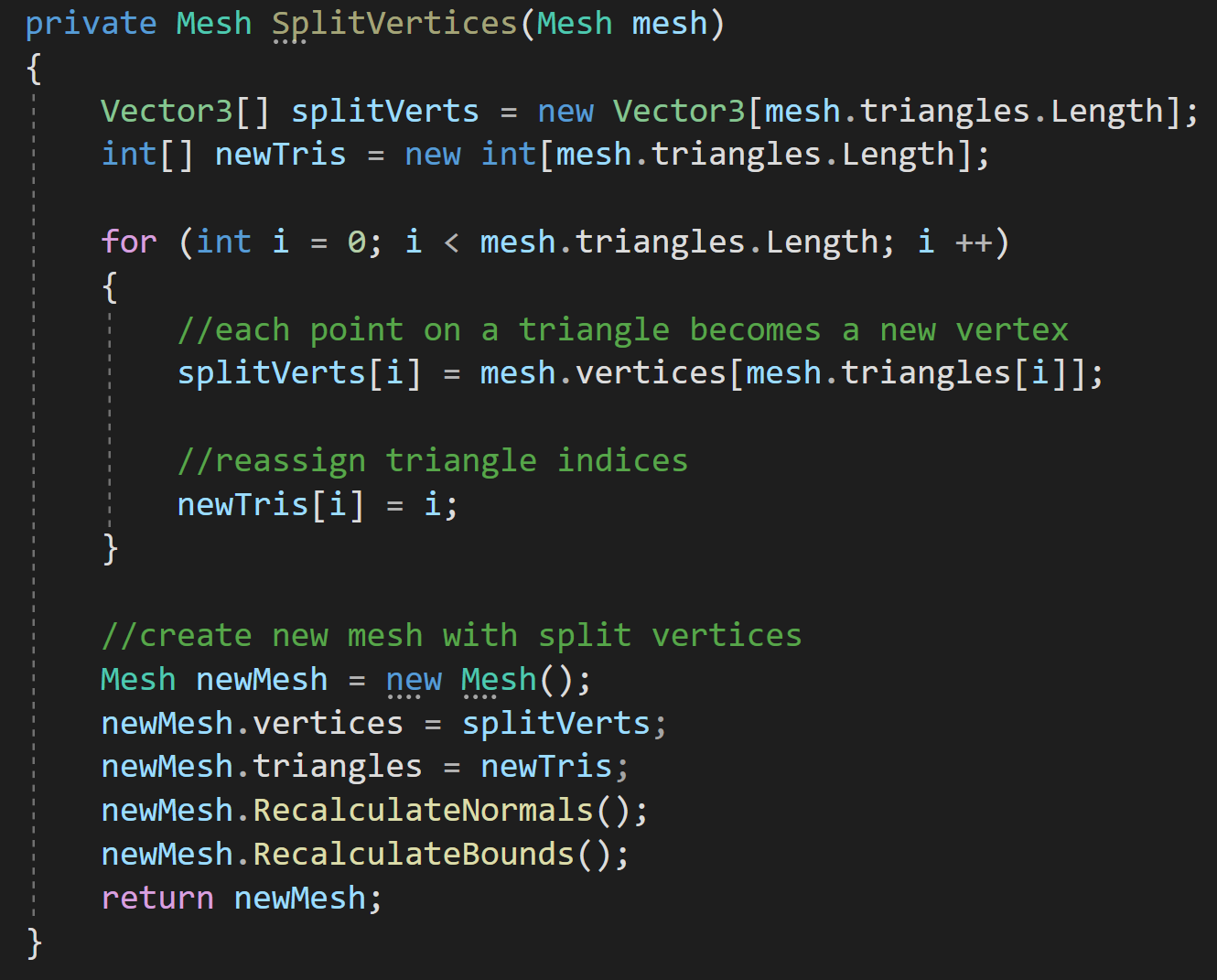
To get started, we create a new array for the split vertices that is the length of mesh’s triangle array - each point on a triangle needs a unique vertex. For simplicity and clarity, I also create a new triangle array for use by are new mesh.

From there we iterate through our number of triangles storing vertices for each point on a triangle and reassigning indices in the triangle array.

The last step is to build a new mesh with the new vertices and new triangles. You could reuse the incoming mesh, but creating a new one felt clearer. Reusing the incoming mesh could also let you avoid creating a new array for the triangles.

That’s it. Pretty simple but something that I hadn’t found documented in other places. Hopefully its useful to someone.

Minute 5 to Minute 10 - Completing the Game Loop

So here I am making another Dev Log post on my project Deep Space Directive and I’ve made a ton of progress! Placeholder art is gone, bugs have been squashed, a tile-based fog of war has been added, a Steam store page is up and running, and so many other small details are getting polished. It’s starting to look and feel like a real game!

With any game project I’ve ever worked on there are successes and challenges. And to be honest one of the things I love most about making games is the creative problem-solving process. The problem-solving space is SO BIG. I love it. There are so many ways to solve a given problem. Some good, some bad, and those rare rainbow unicorn solutions that make everything better.

Which brings me to the topic of this post! I’ve been working to complete the game loop for Deep Space Directive - all with the goal of releasing a demo and starting to get some feedback. I’ve been searching for one of those rare solutions that solves multiple problems and adds to the player experience.

And I think I’ve found it.

But first! Let’s rewind a bit so you know where I started.

Game Loop

The first half of the game loop is working. The player is guided through adding the basic buildings and when that’s done the first wave of enemies spawns. But after that, we start to run into problems. Why should the player continue? And what should they continue to do? They’re kind of left hanging…

Check out that amazing graphic!

I know, this all sounds pretty basic and like things I should have planned out earlier. Maybe I should have but I didn’t and frankly I like letting the design evolve somewhat organically. I had an overall vision and plan for the game, but I knew the details would get challenged once I could play the game and I’d need to tweak, adjust, or scrap ideas altogether in order to make the game fun.

Or at least, this is my current rationalization for not seeing these problems when I was first planning the game.

Taking a Few Steps Back

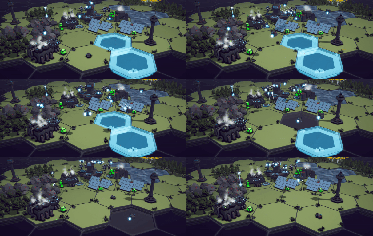
One of the original design pillars of the game was to allow the player to build and shape the world around them. So I wanted to make the starting landmass small to create a need for the player to expand the terrain. But to build land you need the resources dropped by the enemy and the enemy only spawns at night. Which means you have to wait to kill the enemy and collect the resources.

You might see where I’m going with this… It adds up to a slow start to the game. Which isn’t a great way to engage new players! So, I came up with a few solutions.

Option 1: Increase the drop rate of the land-building resource.

Option 2: Spawn more enemies.

Option 3: Give the player more to do by making more buildings available at the start of the game.

Any of these solutions solve the problem now but would cause a bigger design problem down the road.

Increasing the drop rate makes for resource inflation. Enemy waves will get substantially bigger and the amount of land-building resources will scale with those larger waves. Spawning more enemies does the exact same thing. Making more buildings available at the beginning of the game takes a lot of development time and reduces the amount the player gets to earn or unlock later in the game.

This is why I was stuck. I had three options. None of them solved the problem in a good way.

More Problems

Which brings up yet another problem that I’ve been trying to solve. With a small initial starting landmass, it's easy to put buildings in the "wrong" place and block the "correct" placement of other buildings.

Putting solar panels near water seems like a perfectly reasonable thing to do! But then it comes time to place the water pump which MUST be placed next to water. With limited waterfront real estate it’s really easy to run out of building locations.

I don’t want to hold the player’s hand too much, but this kind of mistake early on would be more than frustrating and a really good reason to quit and try a different game.

It looks Nice, but where does the water pump get built?

Maybe this all sounds bad like a failed project, but these issues are so central to the game being fun, to me it seems reasonable to spend a lot of time trying to solve these problems. Again, despite what might appear as complaining, what I see is a challenge and problem to solve! And I love that!

Moving Forward

When I get stuck or am hyper-focused on a particular problem, I’ve learned to take a step back, get a different perspective, and ask myself a few questions.

What is the real problem? What is it that I’m actually trying to achieve? Is there a bigger overarching problem, that if solved would solve this problem too?

In this case, what I want is for the player to continue to build their base with their current level of tech. But there's no space to build. Not to mention that the player doesn’t have any motivation to continue building. Nothing is asking for more food or more metal ore. Things are good. So why would the player do anything?

When it comes to solving problems, I’m a pretty firm believer that more isn’t better. More tech. More content. More code. Those things don’t necessarily make for a better game. Better is better.

I’ve also often found that multiple problems can often be solved by a single good choice or design decision. And it’s that rare unicorn solution that I’m so determined to find!

Solving Initial Building Placement

Of course, as always, there’s more than one solution to any given problem. My first thought to solve the building placement was to add in some helper system for the player to show where they should or shouldn’t put the building - some nice visual overlay as the player is adding buildings. This could add some polish and solve one of the problems, but It doesn’t solve the larger pacing problem of what the player should do after the first wave of enemies.

This solution also feels like feature creep… One more manager. One more system to create, debug, and maintain. It sets off internal mental warnings that I’m trying to solve a problem by doing more not being better.

And! Real the issue is less about the player knowing exactly where to put the buildings and more about the player easily blocking the few positions near resources early in the game.

Realizing this was a breakthrough.

So! Why not surround the water and metal ore with buildable grass tiles? When this dawned on me I couldn’t believe how simple it was. Both in terms of the idea itself and the implementation. A couple of lines of code to create a new coroutine and it works!

Problem solved! I love it when this happens.

Once again, simple beats complex! Not only can the player not realistically screw up the placement of the first few buildings - they now have more land and more area to expand and build. This also turns out to be a partial solution to the problem that started this whole post - completing the game loop.

Look at all that lake front real estate!

This small amount of added land means there is now room to expand after that first wave of enemies. There’s room for more mines, more water pumps more everything. I love simple solutions like this. This is exactly what I was looking for!

Still, Need to Complete the Game Loop

Alright, the player now has space to expand and build, but why? Why would they do that? The game loop still isn’t complete. There needs to be something more. Something for the player to accomplish.

The main goal or directive (see what I did there!) of the game is to explore and exploit the resources of a given world and ship those resources off-world. So it totally makes sense that this is how I complete the game loop.

In game design terms, we need a resource “sink.” This creates a demand for resources and consumes those resources. Now, at a cynical level, this is just a fancy fetch quest, which is frankly what a lot of base-building games are - albeit pretty elaborate fetch quests.

So! I give you the final piece of the game loop… The supply ship!

Precious resources will be collected and shipped off-world to make your corporate overlords happy or maybe to support a global war effort - I still need to fine-tune the theming. I’m definitely leaning toward the corporate idea.

Maybe this all sounds obvious. But it feels so good to have the loop complete. It’s a massive step forward in being able to release a demo.

What’s Next?

Well, what gets shipped off-world needs to be more than just a counter or slider that appears on the screen and slowly increments toward completion. I want it to be meaningful to the player and to do that there needs to be some type of reward connected to completing the directive.

And this is what I’m currently working on. It might be as simple as choosing directives (and rewards) from a list or it might get integrated into a tech-tree-like approach. I’m not sure what will feel best as a player. I might also use one solution for the demo and another for the full game… We’ll just have to wait and see what happens.

Visual Debugging with Gizmos

We’re going to keep this post short and sweet, cause that’s what I do here…

A few weeks ago, or maybe months ago, I rediscovered Unity’s gizmos as a fantastic visual debugging tool. It might be a little bit of a niche use case for some, but when you need gizmos they can be super useful.

Now there’s a ton that you can do with gizmos (and handles) in making custom tools. I’m not going there. For this post, we’re keeping it simple and using Gizmos just for debugging and visualizations with the big goal of adding one more easy-to-use tool to your toolbox.

Simple Example

Let’s look at a simple example. Someone on my Discord was creating a power-up for their 2D platformer. When the power-up was collected or used the player would do a zigzag jump upward. The path of the jump was to be predetermined by the position of some empty children objects. Using empty children objects is easy, but often all we really need is a Vector3 position. The empty child is just a stand-in that can be easily moved and visualized in the sceneview.

But! In the case of the zigzag jump, gizmos could remove the need for those empty objects cleaning up the hierarchy while still providing a visualization of those positions. So let’s take a look at how that would work.

First, we need to create a list of Vector3’s - these will be positions relative to the player. Then we need to add the function OnDrawGizmos(). In the function we can check if the list is empty if it’s not then we can draw our gizmos.

To start drawing, we first need to set a color for the gizmos.

Side note: It’s important here to know that you are setting the color for all the gizmos that will be drawn after setting the color or until the color is set to a different value. You are not setting the color for a particular gizmo. It’s a bit different than other Unity objects, but it’s pretty easy all the same.

Make sure the Show gizmos button is toggled on

With the color set we can then iterate through the points in our list and call Gizmo.DrawSphere(). This function takes in a position, which is in world space, as well as the radius of the sphere to be drawn.

And that’s it.

If we jump back into Unity, making sure the component is added to an object, we can then set values in our list and the gizmos will be drawn in realtime as we adjust the Vector3 values.

If you’re not seeing the gizmos make sure you are looking at the scene view, gizmos will not be drawn in the game view, and that the “show gizmos” button is toggled on.


Adding Lines

Okay, let’s take a it a step further. Let’s imagine you want to now want to add a line to the path to make an even better visualization. Which could have the added bonus of making sure you points are in the correct order!

Now we could definitely do this all in one for loop, but for the sake of clarity I’m going to add a second loop.

However, before the start of the second loop, I’m going to change the color of the gizmos to blue.

In our case, we need a bit of special handling as we don’t have a starting point in the list. So if the index is zero, we’re going to draw the line from “this” object to the first point. If the index isn’t zero, we’ll draw from the previous point to the current point.

Once again, noting that our points are in local space and we are drawing in world space so we have to add the position of “this” object to each point.

Quick style comment, if you don’t like the lines showing through the spheres or in reality being drawn on top of the spheres, you can move the line drawing code above the sphere drawing code - this will cause the lines to get drawn first making things look a bit nicer.


Drawing When Selected

If you’d like your gizmos to only be drawn when the object is selected you can put all of your code into OnDrawGizmosSelected() instead of OnDrawGizmos().

Or, if you want to get wild and crazy you could put the line drawing code in OnDrawGizmosSelected() and leave the sphere drawing code in OnDrawGizmos().

Options. You’ve ‘em.

More Things to Draw

There are several more types of gizmos that can be drawn such as rays, icons, wire spheres, and all kinds of other good stuff. Check out the Unity documentation for more details. Each gizmo has its own use, but the big-picture functionality is largely the same. Add one of the DrawGizmo functions, set the color, and then draw your gizmo with whatever logic you might need.

Personally, I’ve found gizmos immensely useful with data generated at runtime. If you look, you’ll find gizmos used in all kinds of 3rd party assets or tools to help debug or find the correct settings for a particular use case.

Easy Mode - Unity's New Input System

I’ve seen a few comments in my videos about Unity’s “new” input system that the system is just harder to use than the old input system. This is largely true based on how my channel and lots of other channels have presented the system.

But there’s an Easy Mode that rarely get talked about. Easy mode loses some of the power and flexibility of the new input system, but it claws back almost all of the ease of use of the old input system. So if you’re prototyping or if you are okay with hardcoding your input then easy mode presents a quick and easy way to get player input working all with the new input system. It even brings some advantages over the old input system when it comes to gamepad support.

Easy Mode

Keyboard inputs

My preferred method with the new input system is to generate a C# class and use C# events. There are lots of advantages to this, but it can take some time to set up and it can fluff up your code by subscribing, unsubscribing, and responding to those events. And I think developers wanting to avoid that workflow is pretty reasonable if you’re just trying to quickly prototype something or your project is simple.

So! Easy Mode!

Keyboard

In an update function, we can do the same kinds of things that we could with the old input system. Like what’s shown to the right to get input from the keyboard.

This code has the same functionality as GetKey, GetKeyDown, and GetKeyUp, but instead, we are using isPressed, wasPressedThisFrame, and wasReleasedThisFrame.

Hopefully, it goes without saying, but this works with any key on the keyboard you just change the key that’s being queried. If you can’t find the exact key, make use of autocomplete. It’s definitely your friend.

Mouse button inputs

Mouse

We can do similar things with the mouse and recreate the functionality of GetMouseButton, GetMouseButtonDown, and GetMouseButtonUp.

Pretty easy.

So, what about reading the position of the mouse? Not an issue. This can be really handy for scrolling a map when players mouse over to an edge of the screen OR when you need to raycast from the camera through the mouse to detect where in the scene a player may be pointing or clicking.

How about the scroll wheel? Again, no problem, just read the value and you get back a vector2 just like with the old system.

REading the mouse positon

Reading the Mouse Scroll Wheel

Gamepads

Is there an easy mode with gamepads? Yep, and it works pretty much the same as the keyboard and mouse. We can read the left and right sticks, all of the buttons, as well as the shoulders and triggers.

This is also where we see the first big advantage of easy mode over the old input system. We’re not having to muck about in the old input manager defining this and that and filling our code with string references to axes and buttons. It just works.

One note of caution, it’s quite possible that a gamepad is not connected (as opposed to a keyboard or mouse). So checking if the current gamepad is null before reading values can help prevent errors in the console.

Conclusion

Easy mode is awesome. Especially for gamepads where it truly makes for easier functionality than with the old input system. And because it is the NEW input system a wide range of gamepads should be supported out of the box with zero extra effort.

But you are leaving some functionality on the table with easy mode. Most notably in my mind, you don’t easily have support for multiple gamepads. Plus if you are creating equal functionality for keyboards and gamepads you’ll likely have some duplicate and rather ugly code all sitting in the middle of an update function. But if you are just quickly prototyping or working on a truly simple project that may be a worthwhile trade-off.

Level Builder - From Pixels to Playable Level

A while back for a game jam I made a tool that would import a PNG file and use the color data to quickly generate a level. It wasn’t perfect, but it meant I could quickly iterate on a level by erasing a few pixels and adding a few others. It made my game reasonable to build in 48 hours.

Then a few weeks ago a local game developer asked a question that reminded me of that old tool. So I dug it out. Polished it a bit and after sharing the tool, I realized it might make for an interesting video. So here we are…

It looks like Brackeys made a tool like this too. My game jam was 6 months before his video and I think this version might be a bit more general;)

Creating the Image

To get started, you’re going to need any image creation tool that can paint individual pixels. Photoshop, GIMP, even MS Paint can make this happen. I personally use Affinity Photo. Like a lot of these tools Affinity Photo has a grid and a pixel painting tool. It can also be really helpful if you can paint to multiple layers. The extra layers can be used to add props or details to a level.

For my system, fully transparent is going to represent an empty location on the level. You can do it with white or black, but transparent seems like a natural choice. Beyond that, you can use any colors you want.

I choose to draw my dungeon walls in black, the floor in white and to keep the code simpler I’ve given the corners a unique color too (red). By giving the corners a color, I don’t have to try to detect them, but that could be done too.

Prefab Info data structure

While that’s enough to build the basic structure, we can handle as many colors as we want, so I’ve gone ahead and added blue and green which we can use to add variation to the dungeon floor with slightly different prefabs.

Basic Data Structure

Each of the colors on our image will represent a different prefab or a prefab randomly chosen from a list. To make that work we need a data structure that holds a reference to the color as well as the prefab or list of prefabs.

Optionally, I’ve added a Prefab type which will allow special handling of the instantiated objects such as rotating to match neighboring tiles. Additionally, a boolean will allow random rotation which is useful for decorative objects.

Level Builder Component

With our data structure built, we need our level builder component that will make use of the data.

In the Level Builder class, we’ll need a few variables. The first is a bool that will act as a button (if you have Odin Inspector just use the button attribute). Then we’ve got a Texture2D slot for our image and a float for the grid size. The value of your grid size will depend on the size of your prefab and may take a little fine-tuning. If your objects have gaps between them decrease the grid size or if they overlap then increase the size.

I’d definitely recommend doing your best to use a nice integer-sized prefab! It may be helpful to remember the default Unity cube is 1 unit wide.

Then we have a 2D array of our new data type. This will store all the info to create our level. And finally, we have a gameObject that will be the root object for our instantiated level objects. This will keep things organized and make our lives easier down the road when we want to regenerate a level.

Finding All the Colors

On Validate Function - in the Level Builder class

Next, we can create a list of our new data type. Since we are going to want to add prefabs in the inspector per color, it would be nice if the list would automatically populate when the texture was added or changed. This way we don’t miss a color or have to manually enter all the colors. We can do this in an OnValidate function which gets called by Unity whenever a value in the level builder inspector changes.

Inside the OnValidate function, we check if the map is null, if not we’ll read through all the pixels using map.GetPixels32 - this returns an array of all the pixel colors in the map.

Level Builder Inspector -auto Populated colors

I’m using Color32 instead of Color, to let color comparison be done a bit more easily as we’ll be dealing with integers (bytes) instead of floats for the RGBA channels.

If we see a color whose alpha channel is zero, meaning it’s transparent we’ll continue and go to the next pixel. This allows us to use transparency as a way of leaving a blank space in our level.

After that, we’ll use a LINQ statement to check if any of the PrefabInfos in the list have the same color as our current pixel. If there’s no PrefabInfo that has this color, we’ll create a new instance, assign the color and add it to the list.

The result is a nice tidy list with each of the colors in the image listed in the inspector.

This is a massive improvement over my earlier versions of the tool where you’d have put in the colors manually, which was a huge pain and bottleneck in the workflow. Now, you can put any colors you want and you don’t have to worry about copying the color codes from your image editor or vice versa. This should work with any and every 32-bit color. So go nuts.

Reading the Image File

Our next step is to read the pixel data (again) but this time we’re going to generate a more easily used 2D array of PrefabInfos. After getting all the color data, again from GetPixels32, we can initialize our new 2D array to match the image's size - using the image's width and height.

How to get the pixel index from the For Loops

After that, we can use nested for loops to iterate through each location in our 2D array.

For each location, given by the integers i and j, we can get the color in the pixels array at a given location. If that color can be found in our list of PrefabInfo we assign a reference to that PrefabInfo in the 2D array.

There’s a lot going on in that one line of code!

The diagram to the right shows how the pixel index, is calculated from the i and j variables. The “4” in the equation comes from the width of the example. Also worth noting, Unity’s GetPixel function starts with pixel zero in the bottom left corner.

You could do this in the OnValidate function, but that would mean every time you add or remove a prefab to a list or toggle a bool you’d recalculate this array… Instead, I choose to use a little trick to create a button out of a bool.

Creating the Map

With our array of PrefabInfo populated, we can now instantiate our prefabs with a CreateMap function. Here we’ll check if the terrain container is not null and destroy the object if it’s not null. This has the effect of removing the previously generated level. This allows for quicker and easier iteration as the old level objects get cleaned up.

With the terrain container destroyed, we’ll create a new one, give it a name, and set its position. Since I’m doing this in the editor I’m not worried about the performance of creating and destroying objects. If you want to do this at runtime using an Object Pooling solution would be advisable and maybe also using a co-routine to spread the creation out over multiple frames.

Then we get to iterate through are 2D array again. We’ll check to make sure the array isn’t null at the location and if the prefab for the prefab info that location isn’t null. If either is null, we’ll skip to the next element in the array.

If we’re good to go, we grab the prefab from the PrefabInfo to instantiate it. We can use the i and j coordinates along with the grid size to place the prefab at the correct location in the scene.

The next line is one that’s optional, but I’d highly recommend it. That is to name the new object based on its coordinates. This really helps with debugging later on!

After that, we set the parent to our terrain container and if we’ve set the prefab to rotate we can randomly rotate the new instance.

Making It Go

At this point, I’d strongly recommend you do some basic testing. Are there errors? Are the prefabs getting placed correctly? Is the grid size correct? Your level won’t look perfect, but it should be good enough to test and debug.

But to do that you need to be able to call on the functions. If you’re using Odin Inspector you can use a button attribute, but for those who aren’t here’s a little trick that you may or may not know.

On top of our class definition, we can add the attribute ExcuteInEditMode. Check the third image on this post. This will have the effect of the update function getting called every frame (the editor still has “frames” in edit mode).

Then we can create an update function that checks if the map texture is null if it’s not we’ll check if our boolean toggle is true. If it is then we’ll call our functions and create our level. Really important! We also want to make sure to flip the value of our boolean so we don’t keep creating a map every frame - which would be a pretty good way to make Unity run really slow.

Prefab Examples - Dungeon

Depending on your prefabs and what you’re building all the work above may be all you need, but if you’re building something like a dungeon you’re liking finding that the corners don’t line up or the walls are facing the wrong direction. And that’s where the function TileSpecialHandling comes in. EVERYTHING that goes into that function will depend on your prefabs. So before I show some examples of what you can do with that function let me show you what my prefabs look like.

I’m using the “Low Poly Dungeons” asset by Just Create. There is a free version as well that I think has all you need to follow along. Just Create has kindly given me a lot of their assets to use in various videos.

The assets in this pack are great but don’t necessarily fit a grid out of the box. If I use them as is, I get a result like the image to the right. There are gaps between the floor and the walls and the pillars that are placed in the corners don’t touch the walls. Not to mention that some of the walls aren’t rotated in the correct direction.

We’ll fix the rotation in a bit. For now, the gaps are an easy fix.

Instead of using the built-in prefabs, I created an empty object and then set the walls (and pillars) as children of the empty. Then I could add a floor to both the walls and the pillars. In addition, the pillars also got two half walls to complete a “corner”.

Wall prefab with floor

Pillar with floor and two half walls.

When creating prefabs, it’s important to make sure the children are centered around the origin of the parent and still fit your grid size.

With these changes, my dungeon is starting to look a bit better.

Special Handling

The TileSpecialHandling function does exactly what it says. It will let us deal with each type, as defined by the enum, in a unique way. This can allow us to rotate walls and corners or any other number of things you might need for your specific project.

The function takes in the coordinates of the tiles, the prefab info as well as a reference to the gameObject itself.

A switch statement then calls unique functions for each type of tile. I’ll show my examples, but this is definitely where your code is going to diverge from mine as your project, your prefabs, and your goals are different.

Rotating Walls

Getting the walls facing the right direction depends on what’s around the walls. So while not too tricky, it is easy to get lost in the details and all the indices.

The big picture idea is we are trying to determine where the floor tile is and rotate the wall to face that direction. We look to the neighboring tiles by adding or subtracting one to a coordinate in the map array and check the enum at that position. If we find a floor we rotate accordingly. Again depending on your prefabs or exact setup, this may take some guessing and checking.

In this case, we only need to check 3 of our 4 neighbors, since if the unchecked neighbor is a floor then the wall is already facing the correct direction.

I’ve also thrown in a null check in the case that a prefabInfo was not assigned to that location. In my example I never got to the edges of the map, if you might, you will need to put in some additional checks to make sure that the coordinates are valid for the map array. Or just leave a ring of transparent pixels around the outside.

Rotating Corners

This is a bit trickier. With a corner, we need to find two nearby walls or corners. Depending on the orientation of those walls and corners we rotate the object. So a bit more complex but not too bad.

When debugging this type of function I’ve found the naming of the tile objects particularly valuable. More than a few times I thought I was checking one object and was in fact checking another.

To make this a bit easier and keep the code looking clean, I’ve added an extension function to determine if a neighbor is either a wall or a corner. Nothing too fancy, just keeps the if statements a lot simpler and easier to read.

With the walls and corners rotated our dungeon is looking much better.


Rotating Lights

I figured lights would make for better video eye candy and it’s something that most developers are going to want to put in their game.

So, I made a light prefab that when located and rotated to match a wall tile at the same location it would sit on the wall correctly.

You could place and rotate lights with the same pixel map for the walls and floors, but I think there’s a good argument for having details like lights and other props on a second map. I did this by adding a second (transparent) layer on my map. This allowed me to easily line up the lights (and other details) with the walls and floor. I then export just the new layer as an additional PNG file. I also then added a second instance of the level builder to the scene. This second instance will manage the lights and props.

Second layer to align details with the floor

Addition level builder for details

Since I’ve used a second level builder I don’t (easily) have access to the the map array from the other level builder. This means I can’t use wall and floor data to align my lights. Instead, assuming the walls have already been added, we can make use of Physics.OverLapSphere to detect nearby objects. Then for the sake of ease, although I hate to do it, we can check the names of the objects found, and if there’s a wall we can align the rotation of the light to that of the wall. Or in this case the parent of the wall.

Final Thoughts and Improvements

The goal of this tool is rapid prototyping. It’s really quick to build a pixel map and drop it into the inspector. Even the amount of code you have to write is relatively small. For a game jam or even a commercial game, this tool can save hours and hours of work manually lining up prefabs to create individual levels.

Runtime Use

That said this tool, as is, is designed for use in the editor. It roughs out the level and you’re likely going to want to tweak things manually. But! With some more sophistication and refining of the “special handling” of tiles, this could be used to allow players to create and implement their own levels! A relatively simple in-game editor could allow the player to load a PNG and then assign prefabs to the colors found in the image. A pretty slick way for players to create content for your game!

Make It Better

If I was to use this tool (again) in a project to create levels I would likely modify the code to handle multiple maps within the same instance of the level builder. For example a structural map, a details map, a lighting map, and an enemy map. By using multiple maps within one instance it would mean that your lights could be aware of the floor or walls without having to raycast. Enemies could rotate to not face the walls. Or whatever. It would add more functionality if every map was aware of the other maps and would make the tool that much more powerful. But that kind of customization is highly dependent on the specific project so doesn’t really fit in a tutorial.

2D and Tilemaps

As is, the tool is designed for 3D, but it would work perfectly well with placing 2D sprites. If you are using a tilemap, Unity provides Tilemap.SetTile() which would allow easy addition to an existing tilemap. If you’d be interested in seeing a modification of the tool to use a tilemap let me know - leave a comment or reach out on Discord or YouTube. I might challenge the YT community to get the video 1000 likes or something similar before creating a follow-up video. Who knows.

Input Action in the Inspector - New Input System

the “old” input system

Setting a key in the inspector with the “old” input system is pretty easy. Create an instance of a keycode and then use it however you like with GetKey, GetKeyDown, or GetKeyUp.

But what if you’re using the “new” input system? Did you know that you can easily assign input actions in the inspector? I didn’t. And until today I never really had a need for that functionality. For things like menus, buttons, or other objects that might make use of a hotkey this is pretty nice to be able to do.

Background

I wanted to add hotkeys to my building menus

I was working on some UI functionality and wanted to add hotkeys to allow the player to open menus. Normal stuff. But all the menus I was working with were the same type - meaning they were using the same component just with different data and children objects. This meant I couldn’t easily program different keys to trigger different menus without making an ugly mess.

You can add an Input Action to your inspector, but this creates or defines a new input action, which isn’t quite what I wanted to do. I wanted to use an input action that I’ve already created in an Input Action Asset.

But, this sparked a memory from my local multiplayer video where a component made by Unity did allow the selection of input actions in the inspector. So I went digging into that old project to see what I could find.

Input Action Reference

Useful, but not what I was looking for.

It turns out Unity has an Input Action Reference class that’s built into the new input system. And it’s about as simple as it sounds. All you need to do is create an instance in your class, then in the inspector, you’ll be able to select any of the input actions that you’ve created.

Then, assuming you are using the C# generated class, you can subscribe functions to the various events for the input action just like normal. Just don’t forget to enable the input action.

If you’re looking for more info on the new input system itself or aren’t sure how to create input actions with the input system - this blog post will give you a lot more background.

Final Thoughts

This is what I want!

It’s hard to think how this could be simpler… That said, I’m not sure how this system will work if you allow players to rebind keys. My assumption is that using the Input Action Reference instead of an Input Action will work with rebinding, but maybe not. Beyond that, this seems like one more great tool to have that easily allows extra functionality.

Tutorial Hell - Why You're There. How to Get Out.

TL;DR Your projects are over scoped and you are missing a solid skill foundation. There is no magic step. No magic course. No magic book. Build the foundation of your knowledge and finish lots of small and simple projects to build your skills.

You. Me. And everyone who’s going to read this post. Has over-scoped a project. We have big dreams and amazing ideas, but the projects never get finished. By the third, fourth, or maybe fifth failed project it starts to get pretty discouraging. I’d guess more than half of people give up within a year of watching their first tutorial and almost no one makes it to the point of releasing a complete and polished game.

This can be tormenting and dream-crushing. It’s so easy to get stuck watching one video after another. Feeling like the next one will make it all come together. While never feeling like you’re making progress or never feeling like you can truly create something on your own.

Content creators are rewarded for creating engaging content, not for their viewer’s success. Most content out there is well intended, but most of it is oversimplified and ends up selling the viewer a load of horse shit.

Quickly and easily add multiplayer!

Build an inventory system in under 10 minutes!

By glossing over the difficult bits many viewers get in over their heads thinking they are one step closer to their dream game. What feels helpful turns out to be the opposite. Most videos are about the product and not the process. Teaching a process takes time and patience, but neither of these is rewarded by the algorithms of YouTube or Udemy. The result, especially for beginners, is frustration, maybe giving up or all too often starting a search for the next tutorial.

This is tutorial hell.

It’s easy to feel stuck and I think many or even most folks eventually give up trying to make progress. So here’s my hot take on tutorial hell, why you’re there, and how to get out.

Learn More

The quick, dirty, and admittedly blunt reason you’re in tutorial hell? It’s because you don’t know enough to finish your current project. With the internet and clever thumbnails, learning looks like it would be easy. But it isn’t and good resources to learn are hard to find.

Building a solid foundation of knowledge is hard. My number one recommendation for folks who want to learn Unity is to work through the Create with Code course from Unity.

It’s 30 to 40 hours of work. It’s a real course and it’s free! If you are serious about wanting to make games with Unity this is the best starting place I have seen - hands down. You need to 100% this course. No cheating. No skipping content. If you already know the content covered by a lesson or unit, quickly read the text, skip the videos, but do the projects.

Speaking as a classroom teacher for over 15 years, the challenges are where the learning is really going to happen. This is where you will do more than listen and repeat steps. The challenges will make you think. You might even struggle. And that’s okay. Learning comes from forming new neural pathways in your brain and that’s not easy. So buckle up.

When you do finish Create with Code, I promise, you will be able to create and complete a project of your own. It won’t be an MMO, it won’t be the next mobile hit and it certainly won’t be the next hot e-sports title. But it’ll be YOUR game. And you’ll be fucking proud of it.

Your Project Is Too Big

If you’ve finished Create with Code (or have all the skills from that course) and you’re still finding yourself stuck, then the likely culprit is your projects. It’s not you. It’s not the way you think. It’s your projects. They’re too big and too complex. Getting started with a project is “easier than you think” but finishing those projects is so much harder.

Everyone has a graveyard of incomplete projects. Ideas that lived for a few hours or maybe a few months. And that’s fine. Perfectly normal. Frankly, it’s part of the journey. But I see tutorial hell as the result of biting off too much. Trying to build your dream game too early. Or not having the skills or the team to build that dream game.

But! This doesn’t mean you are giving up on that dream project.

So here’s my advice. Pick ONE mechanic. Running, jumping, shooting, or maybe just clicking. Or be more creative. It doesn’t really matter. Make a game around that singular mechanic and give yourself one month to finish the game. That’s it. No spending money. No 3rd party assets. Use free art if you want, but nothing else that isn’t built into the game engine and of your own creation. And no HDRP or stupid shit like that. Basic. Game.

At the end of the month if your game isn’t done. You designed too big of a game. Regardless you’ve learned something. So you’re done. Close the project. Basta cosi.

Pick a new mechanic. If your scope was wrong last month then adjust. But still no spending money. Zero. If you finished your last project, this time you are going to add more polish. More particles, more SFX, and more overall juice. You still have a month. No more. No less.

This process takes discipline. This is the actual hard part. If you find yourself wanting to add more mechanics and features. Tell yourself to fuck off and get back to work. If you find yourself getting bored, try designing even smaller games and give yourself two weeks or maybe just one week, but you must finish those smaller projects.

The goal is not to make good games. Or fun games. The goal is to learn to finish a game.

Design. Build. Reflect. Repeat. With each new project pick a new mechanic to explore and add to your knowledge base.

As a rough rule of thumb, you should know how to do at least 80% of each new project WITHOUT help or tutorials. That’s not to say you can’t look up documentation or get a quick refresher, but the goal of quick short projects is to learn and build your knowledge not add to your YouTube view history. If there’s too much that you don’t know how to do, then redesign a smaller project.

Finish 3, 4, or maybe 5 small month-long projects and you’ll be surprised at what you now know how to do. This will be easier for some and some will learn faster than others. But everyone will learn. Everyone will get better.

You’re Out

Easier said than done? Absolutely. But it is this simple and that hard. There is no magic trick. No magic tutorial series. No magic book. Build the foundation of your knowledge and build lots of small and simple projects to build your skills.

If you do? You’ll have found your way out of tutorial hell.

You’ve made it further than most! But you’ve still only started.

Moving forward you start designing slightly bigger games. Games that might combine more than one mechanic. Maybe this is the time to buy books, or maybe pay for a course or two. Or maybe this is the time to start learning to make fun games rather than bigger games. But stick to the rule of thumb - know how to build 80% of your next project before you start.

Upgrade System (Stats Part 2)

Upgrades! Who doesn’t like a good upgrade when enemies are getting tough and you need a little boost?

Implementing a system can be easy if it’s small. An upgrade system is no different. Need to boost the speed of a spaceship? No problem make a variable a bit bigger. But when the number of stats, the number of units, and the number of possible upgrades grows the need for a system becomes more and more obvious.

With 20, 50, or 100 different upgrades you can’t write a new class for each upgrade and have any realistic hope of maintaining that code base let alone debugging each and every upgrade.

So just like I did with my stats system I wanted to share how I created my upgrade system (which is closely tied to my stats system) in hopes that it might spark ideas for you to create your own upgrade system that matches the needs for your project.

Important Details

Just like my Stats system, I wanted my upgrade system to be based on scriptable objects - they provide asset-level data packages that allow for an easy workflow, and frankly I just like them. Just like with my stats system, I’ve continued to make use of Odin Inspector to allow the serialization of dictionaries and access to those dictionaries in the inspector. If you don’t have Odin Inspector, you can use the same workarounds from the stats system to use lists instead of dictionaries.

Base Class

I don’t always love using inheritance, but in this case, I’m using it as I have several varieties of upgrades in my project - including leader upgrades, global upgrades, and building unlock upgrades.

For this post, I’ll show the inheritance, but stay focused on implementing basic upgrades for altering unit stats. If you don’t need different types of upgrades, then I’d suggest you use a single non-abstract Upgrade class.

The base upgrade class is an abstract class because (for me) each type of upgrade will need to implement DoUpgrade slightly differently and I don’t want any instances of the base Upgrade class in the project. The class defines some basic properties such as a name, a description, cost, and an icon for the UI.

Stats Upgrade

All the real functionality comes in the StatsUpgrade subclass. Here I define two important collections.

The first is a list of the units that this upgrade is to be applied to. Notice that it’s actually a list of stats objects (which are themselves scriptable objects) and not the prefabs of the unit objects. I simply drag in the stats scriptable object for any unit that I want to apply this upgrade to.

The second collection is a dictionary, but could easily be a list, of the individual stats that are affected by this upgrade and the amount that the stat is altered. Again, I’m manually adding items to define the upgrade.

Then the real functionality comes from the DoUgprade function, but even that is pretty simple. All that happens is we iterate through all the stats to upgrade and call UnlockUpgrade and pass in the upgrade itself.

That’s it. That’s all the stats upgrade does.

To make this useful, we need to make some modifications to the stats class that we built in the last post (or video) to handle the upgrades.


Modifying the Stats Class

If you read the post or watched the video on my stats system you may also notice that I’ve implemented my suggestion of an “instance stats” dictionary to separate stats like “health” or “hit points” that will belong not to the type of object but to the instance of an object.

To work with the upgrade system the stats class needs a new list to track the upgrades and it’ll need a handful of new functions as well.

First, we need to define the UnlockUpgrade function that was called in the StatsUpgrade class. This function simply needs to check if the upgrade is already contained in the applied upgrade list and if not add it to the list.

Next, we need to modify our GetStats function to take into account any potential upgrades. To do this we first check if the desired stat is in either the instance stats dictionary or in the stats dictionary. If we find it in either dictionary we get the base value for that stat and pass it into the GetUpgradedValue function.

Inside this new function, we loop through all the applied stat upgrades and check if any of those stat upgrades apply to the current stat type - by looking for that stat type in the dictionary of upgrades to apply.

If we find an upgrade, we apply the value to the stat. If the upgrade was a percent upgrade the math is a bit different but the idea is the same. When we’re done looping through all the possible upgrades we return the value to the GetStats function.

I like this approach as the entire upgrade path is dealt with by the StatsUpgrade and Stats classes. Nothing outside these classes needs to know or even cares what’s going on - keeping things nice and tidy.

Fixing Loose Ends

#1 There is one problem in the current system which comes from using scriptable objects and modifying them in the Unity editor. When applying an upgrade by adding it to a list during play mode that upgrade will still be part of the list when you leave play mode. Meaning you could accidentally ship your game with an upgrade pre-applied which is less than awesome. This is the same reason, I choose to recalculate the upgraded stat value each time the value is requested rather than simply setting the value.

The solution to this is pretty simple. We just need to clear the list of applied upgrades when we enter or exit play mode.

There are no “lifetime” functions like OnEnable or OnDisable for scriptable objects so where and how this function gets called is really up to you. I haven’t come up with a particularly clever solution, if I do I’ll post it here, but for now, my implementation is to simply have a Stats manager that will call the reset function on each stat object when going into play mode. This same stats manager could also tie into a future save system so that applied upgrades can be saved and restored in standalone builds.

If you come up with a more clever solution I’d love to hear about it in the comments below or on the OWS discord.

Reminder: Scriptable objects are not suitable for a save system. So don’t try and turn this “problem” into a janky-ass save system. It just won’t work.

#2 There is an edge case where an upgrade may be applied to one of the “instance stats.” For example, let’s say we get an upgrade that adds 20 hit points to our tanks. With no further modification, any tank that is added AFTER the upgrade is applied should see the extra 20 hit points, but tanks that are already in the scene won’t. Maybe that’s okay or even desired, but in my game not so much.

So here is my suggested fix. It’s not the tidiest, but it works. I’m going to add a public non-static event to the Stats class that will get invoked when an upgrade is applied. Any class that might care about an upgrade can then be notified - which could be useful for functionality such as SFX or VFX or other player feedback to let them know an upgrade has been applied to a particular unit.

Changes to the Stats class

A class subscribing to the new event to process the upgrade


Stats in Unity - The Way I Do it

The goal of this post is to show how I did stats and hopefully give you ideas or at least a starting point to build your own system - your needs are probably different than mine.

A WIP, but the buildings need stats

All games need stats in some shape or form. Maybe it’s just the speed of the player or maybe it’s full-blown RPG levels stats for players, enemies, NPCs, weapons, and armor.

For my current personal project, I knew I was going to need stats on the buildings as well as the enemy units.

A good way to do this is to create a non-monobehaviour stats class that has a public field for every stat. Then all classes that need stats can have a public stats field and you’re good to go. For a lot of uses, this might be more than enough.

Making the stats class a non-monobehavior class it can help enforce some good composition over inheritance type of structure.

While this is good, I wanted something more. The goal of this post is to show how I did stats and hopefully give you ideas or at least a starting point to build your own system - it’s likely that your needs are a bit different than mine.

I wanted something generic. I wanted different units to have different types of stats. I wanted a quick and easy way to get values of stats - without creating all kinds of functions or properties to access individual stats. And lastly, I wanted a stat system that could work with an upgrade system with similar ease and adaptability.

My implementation of an upgrade system will get shared in a follow-up post.

My stats. Easy to use. Easy to Create

Stats in a Collection

Having my stats in a collection (a dictionary in my case, but lists also work) means I can easily add stat types and adjust stat values for a given type of unit. While I very much have a love-hate relationship with assigning values in the inspector - this is a win in my book all day every day.

This was a crucial piece of the puzzle given that not all units will have the same types of stats - farmer and defensive towers have very different functions and so they need different stats!

Using Scriptable Objects

I choose to use a scriptable object (SO) as the container for my stats. This keeps my data separate from the logic that uses the data. Which I like.

It also means that each stats container is an asset and can be shared with any object that needs access to it. It works project-wide.

For example, every “tower” has access to the same stats object. If the UI needs to display stats - they access the same SO. This reduces the need to duplicate information and more importantly reduces possible errors or needs to keep “everything up to date” - the UI and units always have the same values.

Upgrades can also be easy. Apply an upgrade to the stats object and every tower gets it. No need to hunt through the scene for objects of a certain type to apply the upgrade. Additionally, if I apply an upgrade in Level 1, that upgrade can easily transfer over to Level 2 as it can be applied to the SO. Pretty handy.

Important Note: Scriptable objects can be used to transfer data from one scene to another. BUT! They are not a save system and changes in an SO will not persist when leaving play mode - just like changes to a monobehaviour.

As a slight tangent, I also like that the SO, at some level defines the characteristics of the object. For example, in my project I want players to be able to choose a leader at the start of a new game or even at the start of a new level - the leaders effectively act as a global upgrade. By having each leader’s stats on a SO, I can simply drop the leader’s SO into whatever script is handling the leader’s logic and the effect is a change in leadership - a strategy pattern-like effect. The same effect can be had with stats - depending on your exact implementation.

Quick Stat Look-Up

Putting my stats in a dictionary with an enum for the key and the value holding the stat value makes for a quick and easy method to access a given stat. No need to create properties. All I need is one public function that takes in the stat type and returns the value. This continues to work if I add or remove a stat type making my system a little less brittle.

This approach does mean that a stat could be requested and that it isn’t in the dictionary. If this is the case, I return zero and send an error to the console. Ideally, this isn’t happening, but with this implementation, nothing breaks, and as the developer, I get a message letting me know that I either asked for the wrong stat or I haven’t created a stat type for a given unit. Again, nice and clean.

Changing Stat Values

Similarly, if you need to change a stat on the fly - a potential path for an upgrade system - a single public function can again be used. Once again remembering that changes to the SO won’t persist out of play mode.

In this case, I chose to return a negative value if the stat couldn’t be found… Would zero have been better? Maybe. Depends on your use case. I chose negative as things like hit points can be zero without something being wrong.

Potential Issues

For those who are paying attention, there are at least two potential issues with this system.

The Dictionary

You may have noticed that my scriptable object is actually a “SerializedScriptableObject” which isn’t a class built into Unity. Instead, it’s part of Odin Inspector and it allows the serialization and display of dictionaries in the Unity inspector. Without this class, you can’t see the dictionary in the inspector and you can’t add stats in the inspector… It’s a potential problem. There are at least two workarounds - short of buying Odin.

Fix #1

Use a list instead of a dictionary. You would need to create a custom class that has fields for the stat type and the stat value. Then you would need to alter the GetStat() and ChangeStat() functions to iterate through the list and find the result.

A bit messier, but not too bad. If you are concerned about the performance of the list vs a dictionary, while there is definitely a difference, the extra time to iterate through a list of 5, 10, or 20 stat types is marginal at best for most use cases.

Fix #2

But if you insist on using a dictionary, the second fix would be to use your list to populate a dictionary at runtime and then use that dictionary during play mode. This could be done in an initialized function or the first time that a stat is requested. A bit messier, but definitely doable.

The Scriptable Object

Having every unit of a type share stats is a good thing. Unless of course, a stat needs to be for the individual instance. Something like hit points or health. In those cases, we have a problem and need to work around it. So let me propose a couple of solutions.

Fix #1

Have each unit instantiate a copy of the SO when the unit is created. This makes the original SO just a template and each object will have its own copy. This breaks the “every unit of a type shares the same stats” idea, but it means that every unit of a type starts with the same stats.

This effectively means that the SO tracks max values or starting values while the object itself tracks the current value of the stat.

This is the method I have used in my project to prevent all units of a type from sharing health, but unfortunately, it will likely break my upgrade system moving forward. So….

Fix #2

Or you could create an additional dictionary (or list) of stats on the SO that should be copied onto the instance. Then functions such as a DoDamage() that change the value of a local or instance stat simply change the local value instead of changing the value on the SO.

This is likely my preferred solution moving forward as the SO still defines all stats for the object while individual objects have control of their instanced stats.

State of UI in Unity - UI Toolkit

UI Toolkit. It’s free. It’s built into the Unity game engine. It promises way more functionality than UGUI. Sounds perfect, right?

Well. Maybe. Turns out it just isn’t that simple.

So let’s talk about UI Toolkit.

A Bit of History

There is a huge elephant in the room when it comes to UI Toolkit. That being the development timeline.

UI Toolkit, or rather UI elements, was announced sometime in 2017 (I believe) with a roadmap released early in 2018 and the first release with some functionality came in Unity 2019.1. This was all leading to the goal of having parity with UGUI with the release of Unity 2020.3.

While UI Toolkit has come a long way - it’s still not able to fully replace UGUI. The latest official release from Unity says UI Toolkit is in maintenance mode through the Unity 2022 cycle and no new features will be added until the release of Unity 2023.

Based on the recent Unity release pattern, this means we likely won’t be seeing a feature-complete UI Toolkit until sometime in the calendar year 2024. That’s 6-7 years from announcement to being feature complete. 7 years ago I was still pretty fast on a mountain bike…

The Pro’s

UI Toolkit offers far better control of UI layout than UGUI. Many of the layout features that I find so attractive about Nova UI are either built into UI Toolkit or are on the roadmap. On top of that, UI Toolkit can be used to create custom editor windows, which neither UGUI nor Nova UI can or will ever do.

Plus! And this is no small thing, UI Toolkit allows styles or themes to be defined and reused. It’s no secret if you’ve watched any of my recent streams, I find color choice and visual design really really hard. With UGUI if you want to tweak the color of a button background, you either make prefabs, which can work sometimes, or you have to change each and every button manually. I hated this workflow so much that I built a janky - but effective - asset to let me define UGUI styles. While Nova is working on themes, they aren’t ready or available for developers just yet.

UI Toolkit also promises far better performance than UGUI - much of it is done behind the scenes with little effort from the developer. With UGUI if you change an element of a canvas the entire canvas has to be redrawn - which isn’t an issue with simple UI but can become a significant issue with more complex designs when you are trying to eke out every little bit of performance.

Despite big significant differences in how to create the UI, to Unity’s credit, much of the programming with UI Toolkit should feel familiar to folks comfortable working with C# and UGUI. While there will certainly be some nuance and naming differences, programming the interactivity of UI Toolkit should not be a major hurdle.

And of course the last big win for UI Toolkit? It’s free! For a lot of folks that right there is all the reason to ignore Nova UI and give Unity’s newest solution a serious go.

Stolen from a Unity Video On UI Toolkit

The Con’s

The biggest question about UI Toolkit is will it ever be done? Will it be feature complete? Will it truly have parity with UGUI? How much will change in the process? Will those changes break your project?

There are two big and commonly used UI features that UI Toolkit doesn’t have (yet). First is world space UI. If you don’t need it. Not a big deal. The second incomplete feature is UI animation. Some is supported but not all. Is this a problem? Maybe? Depends on your project.

Data binding with UI Toolkit, is less than awesome. Finding objects by name? Using strings? This doesn’t feel sustainable or scalable or at the very least it’s just not a pleasant way to work. Even the devs have commented about it and are planning to revamp it with a more generic solution. What exactly that means? We’ll have to see.

With any choice of system, you need to look carefully at what it can do, and what it can’t do, and compare that to what you need to do.

The Toss Up’s

The workflow and design of UI Toolkit largely reflect web design and workflow. Is that a pro? Is that a con? That depends on your experience and maybe your willingness to learn a new approach. For me and I suspect many others this is the deciding factor. UI Toolkit feels TOTALLY different than the UGUI or Nova workflow. The pattern of gameObjects, components, and prefabs is replaced with USS, UXML, and UI documents.

Also, the UI is also no longer really part of the scene - in the sense that you can’t see it in the scene view and it’s really in its own container. The UI elements are NOT scene objects. Again, it’s different which isn’t good or bad but it is really different.

For some, these are the exact reasons to go with UI Toolkit. For others, they’re the perfect reasons to stay with UGUI or Nova UI.

The sceneview (left) vs the GameView (right)

An Experiment

The results. Can you which result came from which UI tool?

I felt like if I was going to make a second video talking about UI options in Unity I really needed to have SOME comparison of the tools. So I set out to make the “same” ui with UGUI, UI Toolkit, and Nova UI. I wanted to create a slider that changed the alpha of an image and buttons that would collapse text. Nothing too fancy, but functions or similar to functions used in a lot of projects.

I spend about a bit longer with UGUI (18:02) than with Nova UI (17:39) and as expected, due to my lack of knowledge and experience, far longer with UI Toolkit (56:16). Those times are based on recording the process with each tool. You can see the final results in the video to the right.

In all cases, default or included assets were used. No formatting of colors, textures, or fonts was intentionally done.

I KNOW that it is possible to make this UI with all three components. The point was not to say one tool is better than another. The point was just to experience each tool and the process of using each tool. That said, for me, with my experience, my brain, and my understanding it was clear that one tool, in particular, is easily the best choice in terms of the workflow and the quality of the final result.

Let me explain more…

My Thoughts on UI Toolkit

I have zero experience with modern web development or design. I’d like to think I can learn and adapt to a new system, but I can’t explain just how foreign UI Toolkit felt to me. Sure I could drag and drop things into the UI Builder and mess around with values in the inspector, but after spending a few hours (more than just the testing above) with it I had way more questions than answers. I was playing and experimenting with Unity’s Dragon Crashers project - I had examples in front of me but I still very much struggled to see how it all worked and connected.

For example, there is a nice-looking slider in the library. It works. There are lots of great options and adjustments in the inspector. But for the life of me, I could not figure out how to scale it on the vertical axis. The horizontal axis, no problem, but make it thicker? Nope.

Video of a UI Toolkit slider at 30 fps…

I did some googling and found the same question online with no posted answer. Now clearly there is an answer. There is a way to do it. But it’s a way that I couldn’t figure out.

And then there’s the UI builder window. There’s no way to sugarcoat it, the performance of UI builder was horrible. I don’t know how else to say it. With just a few elements it’s a non-issue. But load up the main menu of Dragon Crashers and slide a few values around and the editor becomes nearly unusable. You can see the lag in the video to the right. I saw similar results in my simple “experiment” use case too.

Just to make sure I wasn’t crazy or being overly critical I opened up the profiler to do some testing. Sure enough, there’s a HUGE lag spike while dragging a value in the UI Builder inspector. This isn’t a deal breaker, but it sure makes the tool harder to use.

UI Builder lag

Strings? Really? Why?

Then I ran into my active disdain for strings. I will freely admit that when I saw that strings were being used to get references to UI elements I was really put off.

Why? Why do it that way? Why lose strongly typed references? Maybe this is how web development is done and folks are used to it. But this feels like a step backward.

The dev team agrees or at least sees it as an area to improve, so they are looking into “more generic” solutions, but right now those solutions don’t exist and who knows when or if they will materialize.

So Should You Use It?

In my mind, trying to decide if UI Toolkit is the right solution comes down to a handful of questions (and a lovely flow chart).

  1. Do you know and like web design workflows?

  2. Do you need world space UI?

  3. Do you need complete control of UI animations?

  4. Are you okay with the UI system changing?

Final Thoughts

Options are good to have. I see UGUI, UI Toolkit, and Nova UI each as viable UI solutions depending on the needs of the project and the skill set of the developers. Each has shortcomings. None of them are perfect.

UI Toolkit is in this weird alpha/beta mode where it’s been released, but not feature-complete and has potential breaking changes coming in the future. Which means much of the tutorial information out there is outdated. It also doesn’t give content creators a good incentive to make more than just introductory content. This makes it harder for the average user to get up to speed. Unity keeps doing this and feels so counterproductive!

But here’s the best part of the situation. All three of these solutions can be tried for free. Nova has a free version while UGUI and UI Toolkit are shipping with recent versions of Unity. So my advice? Try them. Play with them. Do an experiment like I did. Find the right tool for you and your project. I have my UI solution. I love it. But that doesn’t mean it’s the right solution for everyone.

Knowing When A Coroutine Finishes

Did you know that a coroutine can yield until another coroutine finishes? I didn’t. Let’s talk about it and why it’s useful.

Backstory

A few weeks back, I was working with some 3rd party code that heavily used coroutines. In one place it had a “chain” of coroutines that each called another coroutine sometimes multiple coroutines and this went 5-6 coroutines deep.

First. Yuck.

Second. Holy cow.

For what I was working on, I needed to know when the process (all the coroutines) had finished. The “usual” and often suggested method on the interwebs is to add a class-wide boolean to track when the coroutine is complete - you set it to true when you start and set it to false when you finish.

I’ve never liked this approach, but sometimes it’s good enough.

In the case that I was working with, the boolean approach just wasn’t practical or at least was going to be extra icky. And I definitely wasn’t going to add a boolean parameter to each coroutine and try to pass it through… No chance.

So I got to wondering if there was a better way. It turns out there is. And somehow I’d missed it up until now.

Ironically, if I’d looked closer at the coroutines in the 3rd party code I would have seen the solution in action. Oops… You win some you lose some.

A Better Way

So this may sound like just passing the buck. BUT! You can have a coroutine yield until another coroutine is finished.

(Seriously, how did I not know about this?)

This means in my case, a cluster of sequential coroutines, I can create yet another coroutine and have it yield until the cluster finishes it’s business. So if the coroutines exit early and DON’T make it to the end of the chain - for some reason. I’ll still know that the coroutines are done. I may not know why, but I know it’s done. And that’s a hugely useful thing!

Plus!

We can throw in a function to call when the coroutines have done their business. Frankly, this is often what we really want to do - wait until the coroutine is done and then run some other code.

In my opinion, this works and it works well. But I think it also opens the doors to better code structure (assuming it’s your code and you can change it).

Better Still!

A chain of coroutines makes it hard to debug and in my opinion and makes harder it than necessary to follow the flow of the code. So with what we know now, or at least with what I know now, we could restructure the code and make it easier to read.

So instead of one coroutine calling the next coroutine, I can call them all, sequentially, from within a single wrapping or master coroutine. This avoids the hard to follow “chain” AND it avoids a huge monolithic coroutine (i.e. just making it all one coroutine).

In fact, I used this exact approach in my current personal project where I had several actions that needed to happen sequentially, but also over a controlled period of time. Launching a missile requires a lot of moving pieces - it is actually rocket science!

Launching an ICBM from a missile SILO


Next Level

Coroutine with callback

But we can go one step further!

If you’ve spent any time on my channel or discord you know I love actions and events. I rarely pass up a chance to use them and this is no different!

Rather than have a set function called when the coroutines finish, we can pass in an action that will act as a callback.

Meaning the same coroutine can run, but with a different reaction when it’s finished. This can be super useful if the coroutine is public (yes, coroutines can be started from other classes) or if it is somehow getting invoked by different objects or for different reasons.

I generally don’t love making coroutines public, not sure why, just don’t. But it’s easy enough to add a public function.

Passing in a callback function

Either way, passing in an action (i.e. function) is easy and makes for very useful code and potentially reusable code.